The Heartfulness Institute is a non-for-profit organisation with the aim to bring peace and wellness through the use meditation. As a meditator, I have been associated with Heartfulness since 2016, learning and improving my meditative practice since then.
My work with the Heartfulness Institute looks at promotional and advertising material, through numerous projects, special events and weekly sessions. Banners, A-Frames, posters and DL cards are just a few of the print assets that I have designed over the years, with a lot of my interest in design developing here. I have also expanded my jurisdiction with the organisation, taking over some email marketing responsibilities, participating with the youth group and working alongside international teams to improve the design of the Heartfulness App.
The Heartfulness Insititute underwent a major redesign in 2016, with the aim of becoming more accessible, modern and recognisable in the world, competing with organisations such as Calm and Headspace. Since then, I have assisted in setting up Heartfulness within the health and wellness space with a number of print and digital assets.

Figure 1: One of the earliest standup banners designed for Heartfulness
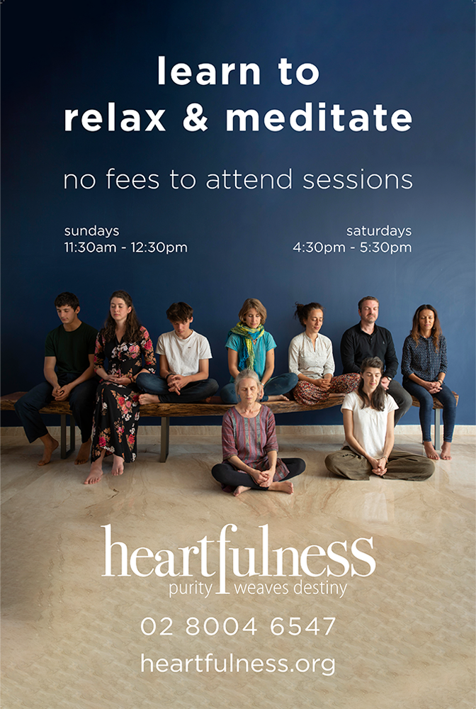
Figure 2: One of the more recent A-frame designs used in suburbs around Sydney.
Over the years, my sense of design has developed and been refined further and further, such that the assets created for Heartfuless have become closer to the organisation they want to be presented as: simple, pure and recognisable.
The DL cards that I had designed over the years became a staple, with refinements coming from all over Australia to improve and create a perfect design. The images on the right showcase the progression of my design of DL cards.
Figure 3: The progression of my visual design in DL cards.
The Heartfulness Oceania Seminar was held in Hyderabad, India in early 2020. It was for all oceanic Heartfulness patrons, aiming to enhance their practice of meditation. My role in this event was to spearhead marketing, social media and creating a theme and a logo.
My team and I worked on a theme over the course of a couple weeks, ideating through various methods, before we arrived at the theme 'Travelling Light'. A double meaning was implied, with a recommendation to travellers to keep their luggage light, with the simultaneous deeper meaning of travelling with less emotional baggage.

Figure 4: The logo designed for the Travelling Light seminar.
The seminar's logo had a number of small, important choices which all helped to convey the meaning of the theme while still remaining pure and simple. The use of a heavier font weight on 'Light' brought light to the double meaning, where people are typically not as light as they want to be. The use of the sack (bindle) tied to the end of the stick highlighted what would happen when you would shed that weight. Finally, a light surrounding the sack underlined the fact that there is always purity in every person.
Figure 5: Variations and working images of the logo designed for the Oceanic Seminar.
Finally, we ensured that we could earn some money with the help of merchandise. There was a set of different options created for the seminar, each with the intention of simply creating a base amount for the youth group's fund.
Figure 6: Merchandise options that patrons of the seminar had access to. These were finally printed in India for easier transportation and lower costs.
As part of a global movement to introduce the wonders of meditation to the youth of today, Youth 2.0 was an international two day seminar with public speakers, meditation sessions and sponsors. This event was held online, with partners around the Oceanic region, including New Zealand, Fiji and more.

Figure 7: The main asset used to convey the theme of 'Painting the Inner Canvas'.
Using a internationally approved branding guideline to help foster international recognition, we adapted the event to suit an Oceanic audience more, with the theme of 'Painting the Inner Canvas'. Speakers from all spheres of life were contacted using an official sponsor document, designed by me in Adobe InDesign.

Figure 8: Youth 2.0's brand and Oceanic theme in a marketing poster.
A social media presence was created as well, such that we could promote our event with the help of paid advertising, teaching me a great deal about the need for social media marketing.
Figure 9: Some of the social media marketing material used to promote the seminar online.